Airbnb Redesign
Redesign Project
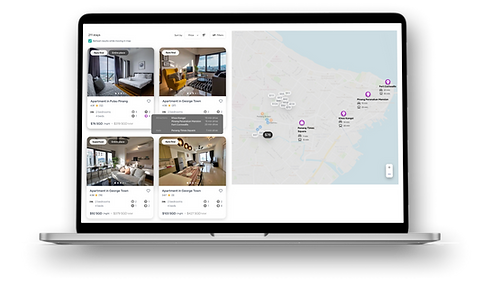
A UX case study to enhance the search map and create a UI to compare listings for Airbnb. The goal was to reduce users' time and effort in shortlisting and selecting a final listing.


ROLES & RESPONSIBILITY
UI/UX researcher, designer (individual project)
DURATION
3 weeks
TOOLS & METHODS
Redesign, User Testing, Prototyping, Figma
Project Overview
In a post-covid world where people are yearning to travel again, Airbnb is used now more than ever. Being the most famous platform for travellers, users can sieve through listings quickly based on information they need, such as pictures, amenities, reviews and host popularity.
Problem Statement
-
However, on the search map, users are unable to see at a glance nearby landmarks, food and transportation. They have to painstakingly zoom into an area, click on the small location icons, zoom back out to the listing, only to forget what they read earlier.
-
Also, users cannot compare easily between shortlisted listings as they have to open multiple tabs and sieve through long details.
Problem Solution
If Airbnb offers location information at a glance and a compare feature, it would allow users to decide on the listing of their choice with a lot less time and effort.
Design Process
.png)
Research
I started by interviewing 5 Airbnb users on their experience using the Airbnb website.
Who are the users?
-
Aged between 25-32
-
Mostly book Airbnb listings through desktop
-
Group travellers
What are their goals?
-
Find out how accessible a listing is, based on nearby landmarks, food and transportation
-
Get everyone’s approval in the decision-making
User Stories
-
As an existing user, I want to be able to know more details about nearby landmarks and transportation.
-
As a user who travels frequently in groups, I want to be able to compare across listings and decide collectively on the final choice.
Define
Based on the interview data, I found and summarize 3 key user frustrations:

User Frustration 1
Limited location info
There is a lack of location information, especially landmarks, on the search map. It is hard to tell what landmarks and transportation are available nearby a listing.
User Frustration 2
Map refreshes without control & clutter
There are usability issues which hamper the user experience. For example, when moving around in the map, the search results completely refreshes without control of the users. This confuses and frustrates them, especially when the user has already scrolled through many pages of results.
The listings are also very cluttered, and users have to make extra effort to zoom in.

User Frustration 3
Hard to compare listings
Currently, it is not efficient to compare alternative listings in Airbnb, especially for group travellers. Users have to do it across multiple tabs opened from their favourites, which incurs memory load.
Ideate
After identifying the user problems, I then proceeded to sketch some ideas down.
Low-Fi Wireframes
 |  |  |
|---|---|---|
 |  |  |
 |
I explored different design configurations, such as including the most popular search filters on the page itself. However, I decided not to adopt that design as I felt that there was too much going on the page and could incur cognitive load.
Hence, I ended up using this one for subsequent iterations:

Mid-Fi Wireframes


I explored different ways of displaying the location information.
I didn't want to stray too far from the current Airbnb design as it is something that users are comfortable and familiar with.
I opted for a card design in the end as it is cleaner and could hold the additional information better.
Prototype
From the mid-fi wireframes, I proceeded to prepare high-fi prototypes for testing.
Search Map page
To tackle User Frustration 1, I came up with a hover design that allows users to see nearby info at a glance:


Transport
Food
Nearest bus, metro
Nearest restaurants, coffeshops


Landmarks
Airport
Nearest places of interests, malls
Nearest airport
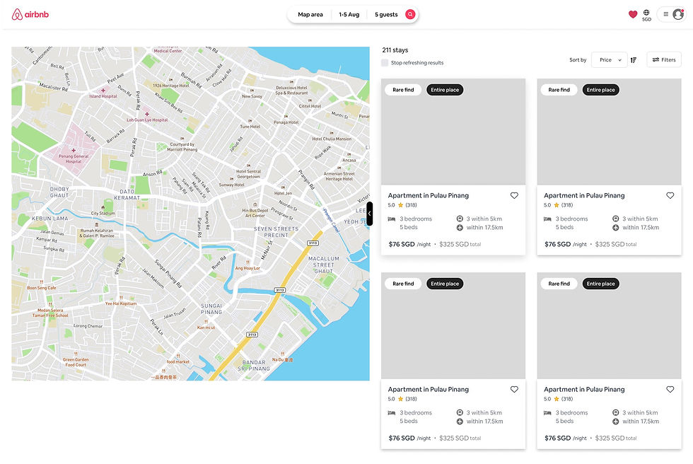
To tackle User Frustration 2, I came up with various design tweaks, e.g. ('stop refreshing results' toggle is included to give users more control, and the currency info is moved to the navbar, to reduce clutter on the map.)

Compare Listings page
To tackle User Frustration 3, I designed a compare function, with the user flow as follows:
Favourites Page > Switch to Compare View > Add Listing/s > Compare according to categories
Test
With the prototypes, I then conducted a usability test with 5 users. It consisted of an impressions test and some open-ended questions.
UT Findings
(areas of improvement)
Search Map
page
-
Users found the landmark icon to be unclear and not self-explanatory. They found it looked more like a museum.
-
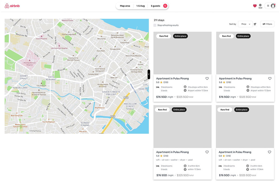
The map location position on the left of the page doesn't fit the mental model of users. They usually remember it being on the right (e.g. googlemaps).
-
The hover enlargement effect of the listing button on the map is too minimal to notice. Users only noticed after some time.
-
The phrasing 'stop refreshing search results' made it seem like the page would go offline. There should be mention of 'while moving in the map'
Compare page
-
Adding listings (to compare) is only single-selection. Multi-selection in the same window would be alot more convenient.
-
Check-in/out timing, an essential piece of information for users, is absent as a category
-
The order of categories does not fit with users' order of importance. They should be as follows:
-
bedroom visuals
-
bathroom visuals
-
amenities
-
location
-
check-in/out timings
-
reviews
-
-
Users expected to magnify pictures of bathrooms and bedrooms when they clicked on the photos but they were unable to do so. The zoom-in function should be included.
Based on these findings, I further made optimizations and improvements to the prototype and translated them into the final output.
Impact
After refining the Airbnb design, the redesign received positive feedback, with an average score (general experience) of 8.5/10 for the search map page, and 8/10 for the compare page.
For the search map page, users liked that they could see everything on one page with the hover interaction. They especially liked the idea of hovering over icons and seeing nearby landmarks. This helps them greatly in shortlisting listings based on ideal location.
For the compare page, users liked that they could see the differences between listings at a glance. They also liked the idea of co-voting for listings, so that it is easier to make a group decision on which listing to choose for a group trip.
Limitations & Reflections
One limitation of the hover-over-icons design (for search map page), is that it is only available for desktop users. Currently for the Airbnb mobile app, because of limited screen space, the map only shows when the user swipes up the bottom sheet to reveal it. Perhaps further exploration can be done in the future, whereby the location information can be shown on the map when the user taps and hold on the icons, with the map bottom sheet appearing.
A possible Airbnb business goal would be to give all listings equal opportunity to be found on the site. Therefore, considering this goal, having an option to sort them by pricing, low to high, (as shown in my design) might not be ideal for the business stakeholders.
If given a future opportunity, I would definitely explore adapting this idea to the mobile app, albeit with some tweaking involved. The challenge of screen size restrictions would be big, but a welcomed one.
1
Map doesn't feel intuitive to be on the left. (mental model, prior experience: map usually appears on right side).
2
Landmark icon found to be unclear and not self-explanatory.
3
On the map, the listing button's hover effect is too minimal to notice. Users only noticed after awhile.
4
'Search places' wouldn't be used much by users.


