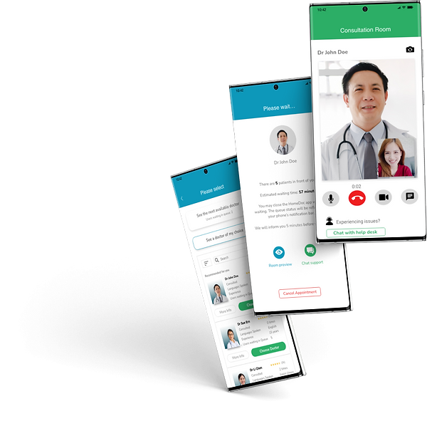
HomeDoc
Telemedicine App
A UX case study to provide care and comfort, by minimizing stress and anxiety associated with online calls and enhance help support during emergencies.
ROLES & RESPONSIBILITY
UI/UX researcher, designer (individual project)
DURATION
2 weeks
TOOLS & METHODS
Research, User Testing, Prototyping, Miro, Adobe XD
Project Overview
Even as Covid-19 becomes an endemic disease, as of July, 2022, 52 percent of Singaporean respondents stated that they feared catching the COVID-19 infection, caused by the novel coronavirus. The share of Singaporeans who feared catching COVID-19 has increased since then.
Problem Statement
As such, the fear of getting infected by other viruses has made Singaporeans more reluctant to visit clinics, and they would rather self-medicate if they have a choice. Also, when we are feeling unwell, it can be difficult to get out of bed, much less make it to the clinic. Travelling to and fro home and hospitals or clinics may also be an issue, especially for those who are less mobile.
Problem Solution
As such, a telehealth app which removes the need to physically visit a doctor’s clinic would be the best solution. The challenge however, was to design an app which considers various touchpoints of the customer experience, such as registration and waiting for the doctor, and pain points, such as anxiety about missing a consultation slot and frustrations with limited customer support.
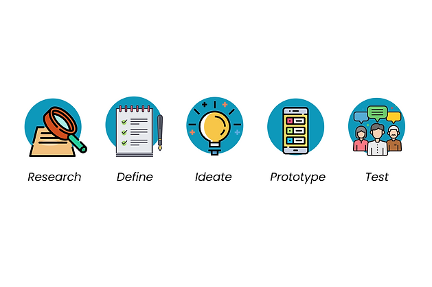
Design Process
.png)
Research
Interview
I started by interviewing 5 people on their experience while visiting the doctor's.
Who are the users?
-
Aged between 27-45
-
Usually self-medicate first, only see doctor if sickness persists/worsens after a few days
What are their goals?
-
Receive medical attention without getting infected by other people at the clinic
-
See the doctor in the shortest amount of time possible
-
Get hold of prescribed medication without waiting too long
User Stories
-
As a user, I prefer to be treated by a doctor who is familiar with my medical history.
-
As a user who has just purchased medication, I want to rest comfortably while waiting for medication.
Competitor Analysis
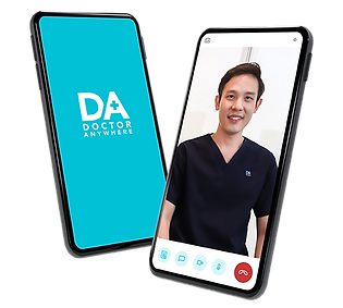
After understanding the user goals for doctor consultations, I went to find out more on the available telemedicine apps in the market.
I came across two popularly used apps, Dr Anywhere and WhiteCoat, and I conducted a UX audit to evaluate areas of improvement.
.png)
Define
Based on the research data, I found and summarize 3 key user frustrations:
User Frustration 1
No proper customer support features
-
With online video consultation, there will bound to be technical issues. This is especially daunting for seniors, as they feel helpless and frustrated when they have no way to contact support. Users are also unable to inform anyone if they choose to reschedule their medication delivery.
User Frustration 2
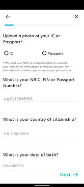
Annoying form-filling repetition
-
Every time when the user books an appointment, he/she has to go through the arduous process of registration. The last thing that anyone who is unwell wants to do is putting in extra effort and energy to do repetitive things.


User Frustration 3
Vague details on how long to wait
-
With no online queue number provided, users must constantly check back the app and see if the consultation has started. This gives them anxiety as they do not want to miss the call. The broad delivery time range and the lack of medicine delivery tracking also gives users who are in desperate need of relief unncessary worry.
Ideate
With the key pain points in mind, I brainstormed some HMWs to come up with some possible solutions.
'How Might We Solve'..?
User Frustration 1:
No proper customer support
-
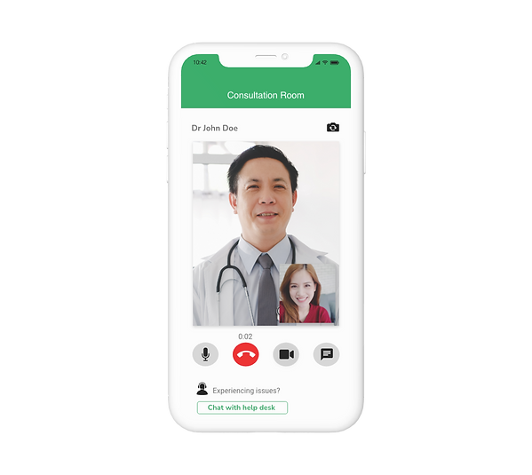
In the video call, have a chat support button, so that the customer can reach help if needed (e.g. doctor doesn't seem to join).
-
Allow users to contact someone if they want to reschedule their medication delivery, or enquire why it is taking so long.
User Frustration 2:
Annoying form-filling repetition
-
Login via Singpass, so that users can easily register without keying in too much information.
-
Sync with a widely used database such as HealthHub, so that medical history and allergies can be carried over.
-
Remember card or payment details.
User Frustration 3:
Vague details on waiting time
-
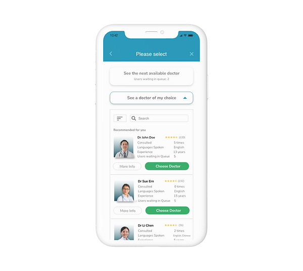
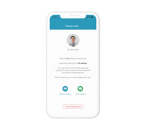
There should be visibility on both how many users are in the queue, and exactly how long more to wait.
-
For medication delivery, users should be able to see where the driver is on a map, relative to their home location.
Task Flows
With the key ideas in mind, I decided to split my screens development into 2 main task flows:
1) Book Appointment
2) Start Video Consultation
Book Appointment

Video Consultation

Prototype
With a better visualization of how the screens would flow, I proceeded to prepare low-fi prototypes.
Book Appointment
Start Video Consultation
Test
I then conducted usability testing with 3 users, using a scenario task. I used low-fidelity instead of high-fidelity prototypes for the testing because I felt that users could understand them without color, and I wanted to focus on function (usability), before form (aesthetics).
.png)
UT Recommendations
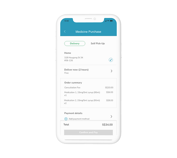
Payment for consultation
Should be together with medication as it fits users' mental models better.
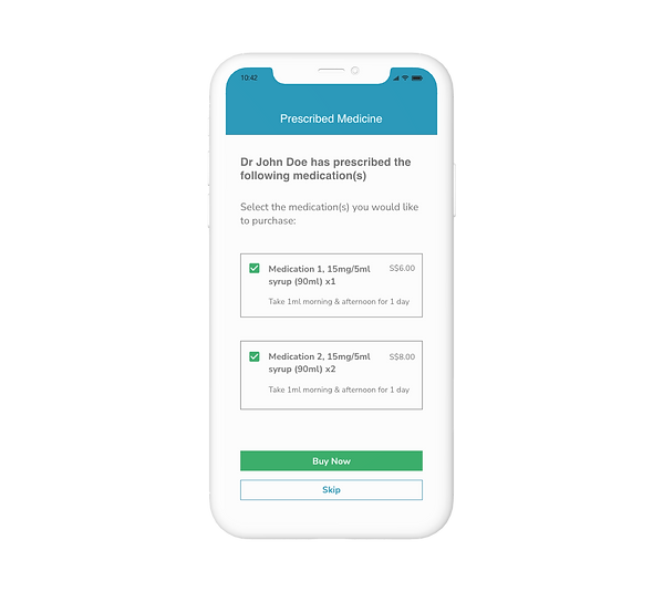
Prescribed medicines
Should not be selected by default, as users remarked that at clinics they purchase whatever that is prescribed.
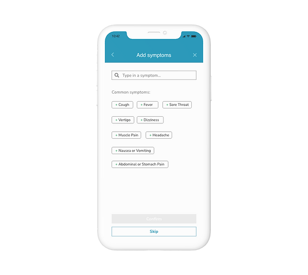
Adding of
symptoms
Should be skippable as usually at clinics, people share their symptoms only when meeting the doctor.
Proceed
button
Should be placed on the right instead of the left, as it is usually shown on the right.
Volume test and video preview
Should be removed as the waiting room UI is too cluttered.
'Video consultation with doctor' button
Should be removed as it is not self-explanatory of its function (which is select other options to compare).
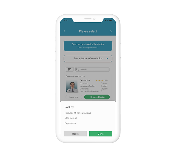
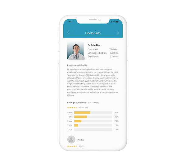
Based on these findings and recommendations, I further made optimizations and improvements to the prototype and translated them into the final output.
Final Output
.png)
.png)
.png)
.png)
.png)
.png)
.png)
.png)
.png)
.png)
.png)
.png)
.png)
.png)
.png)
.png)
.png)
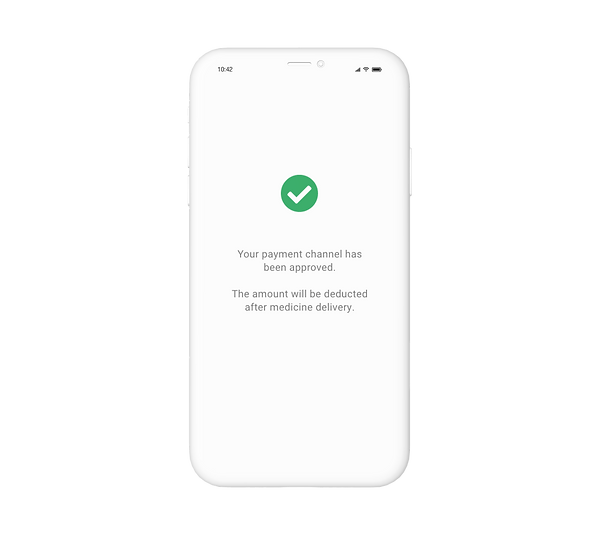.png)
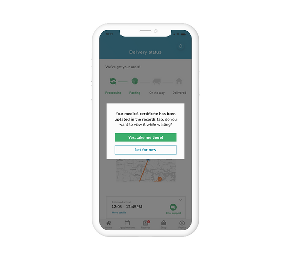.png)
.png)
Impact
Generally with this design, even though there were some usability issues picked up, most of the users passed the usability testing smoothly and had few issues while interacting with the screens. They especially liked that the app design displays the estimated waiting time and the number of users waiting in the queue.
They also liked that the medication delivery timing is clearly presented with map tracking, and it gives a sense of security and assurance, especially when one is suffering from sickly discomfort.
Reflections
One thing that I was reminded of while doing this project is that while I may think of an idea, it might already have been done by someone else.
However, this process has taught me that besides being novel and original; the most important thing is great usability, especially in the areas of customer support and managing customers' waiting experience.


