.png)
SGBanksUnite
MultiBank Dashboard App
A UX case study to help multiple bank account users easily access information that they need on a day-to-day basis.
Summary
As part of the NTUC LearningHub Program, I researched on a new concept for a multibank dashboard mobile app. My process started from user research and ideation, and ended with the creation of a prototype that was tested with a qualitative user study.

DURATION
ROLE

SKILLS
TOOLS
15 Aug - 2 Sep 2022
(2 weeks)
Individual Project
Supervised by HFI Trainers
Persuasive Design, User Research, Prototyping, User Testing
Pen and Paper, Miro, Figma
The Problem
Many Singaporeans have multiple bank accounts, which mean multiple bank apps on their phones.
We sometimes just want to check on a few things in our bank accounts, but there are so many apps that we need to track; and so many things we need to navigate through.
The Solution
I designed SGBanksUnite, a bank dashboard app that allows users to view their bank account balances at a glance.
Key features of SGBanksUnite include:
.png)

All banks at a glance
SGBanksUnite lets you see an overview of the most important information you need day-to-day.
Track cashflow goals
SGBanksUnite guides you on your savings progress, helping you to set and track your milestone goals.


View any bank transaction easily
To ease the burden of tracking transactions across apps, SGBanksUnite lets you see them all at once, in the same place.

The Process
Research on users
To properly design SGBanksUnite, I first needed to understand the motivations and behaviors behind someone who would be using it. How will SGBanksUnite help them? What do they need to know?
I conducted a combination of surveys (10 people) and interviews (5 people) to learn more about my potential users’ viewing habits and previous experiences with bank apps.
Findings
86%
have multiple bank accounts
100%
check their account balances at least once a week
93%
feel money-in/money-out and spending budget are most important
Defining user needs

From my analysis, I found that bank users...
Don’t use over 80% of bank app features; they mostly just view account balance and transactions day-to-day.
Need to monitor multiple bank apps (e.g. DBS, OCBC, UOB).
Feel annoyed with certain bank apps which are not user-friendly.
So I decided that SGBanksUnite needed to address these issues.
Firstly, the viewing experience needed to be efficient and streamlined.
Secondly, SGBanksUnite should allow the user to access multiple banks’ information easily and swiftly.
Most importantly, SGBanksUnite should be as intuitive as possible, and easy-to-use.
Literature review on data integration
Next, fully aware of bank information security concerns, I read up on data security and consent-driven protocols at SGFinDex’s website. I realized that it was plausible and feasible for data integration across banks through Singpass accounts, and this included seven participating banks: Citi, DBS, HSBC, Maybank, OCBC, Standard Chartered and UOB.

Competitive Analysis
I noticed that only 2 platforms were similar to the app that I was working on: DBS NavPlanner and MyMoneySense. I created a table of their features, taking note of their ratings and reviews. I highlighted parts that were done well and where they were lacking.
.png)
Feature Ideation
This involved translating all my existing research into functional features.
I brainstormed over 20 feature ideas, and listed pros & cons of each feature. Weighing them carefully, I picked the strongest features to implement.

Challenge of constraints

However, I considered the highly possibility that because of business goals, banks would not allow SGBanksUnite to perform transactions on their behalf.
As a result, during hi-fidelity prototyping, I made the tough decision to narrow the scope of the project and design the app as a dashboard tracker, focusing on efficiency and convenience instead of having a do-it-all banking app.
Usability Testing

With the low fidelity prototype, I conducted a qualitative think-aloud study with follow-up interviews. 3 participants were involved. The experiment set out to test SGBanksUnite’s motivational qualities, usability and usefulness.
.png)
Preparation - I came up with a hypothesis for each feature and constructed user tasks and interview questions that would help me test these hypotheses.

Think-Aloud Process - Next, I asked my participants to look through the screens, encouraging them to say whatever went through their heads. I wrote down my observations and asked follow-up questions on what made them feel the way they did.

Base of Comparison - I also wanted to compare SGBanksUnite with the most popular bank apps, (DBS, OCBC, UOB), so my participants referenced them during the study, giving their thoughts on them vs SGBanksUnite.

Moderated remote usability test with a participant
UT Findings
.png)
Participants felt that information at a glance that told them how they should save money was particularly useful.
Nielsen usability heuristic
Visibility of system status
.png)
Users were confused whether the dropdown affects the graph, or the entire page.
Nielsen usability heuristic
Visibility of system status

Users disliked that the navigation tab ‘transfer’ did not reflect its true meaning, which is viewing transactions, not performing them.
Nielsen usability heuristic
Match between system and the real world
Results and Data Analysis
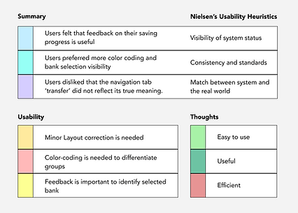
I carried out a thematic analysis on the user responses, by coding each theme with a color. I sorted them according to 1) Findings 2) Usability Issues and 3) Thoughts and Feelings

Thoughts and Feelings
All participants felt:
SGBanksUnite would be useful for tracking account balances of their banks
The interface was generally easy to use and understand, aside from 1 or 2 issues
Highly preferred SGBanksUnite’s way of viewing at one glance, versus tracking individual bank apps
Hi-Fidelity Prototyping
Once I understod how to improve the wireframes, it was time to materialize them into high fidelity prototypes.
Lo-fi to Hi-fi
Low-fi
Hi-fi

.png)
What's improved
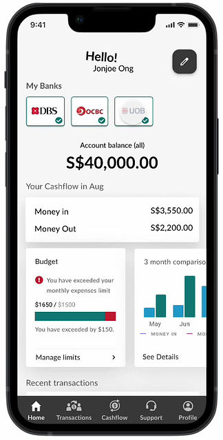
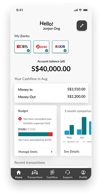
Clear indications that feedback to the user which banks are active
Allow user to easily select and control which bank he/she wants to see
Low-fi
Hi-fi

.png)
What's improved
Dropdown selections are grouped with the table to better inform that it can directly change the graph's state
Additional label is used so user can tell what the numerical value represents
Low-fi
Hi-fi

.png)
What's improved
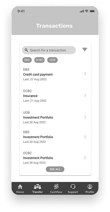
Bank logos are used to help the user identify and group information more quickly
'Transactions' is used instead of 'transfer' to improve understanding that the user views transactions here, not perform them.
Impact & Validation
The design received very positive feedback quantitatively and qualitatively. It helped me validate the assumption that bank users can navigate the experience with ease and this app could meet customers' needs. I was also able to identify some minor usability issues and got them fixed to further enhance usability.
Quotes from users
"I can actually see all the essential information that I need in my accounts at one glance."
DBS & OCBC user, 32 years old
"It is easy to see the transactions from different banks."
DBS & UOB user, 45 years old
"I find it useful to see the cashflow average across the months, and also set my goals to see the projection."
DBS & UOB user, 29 years old
Quantitative Results
(10-point Likert scale rating)
This app is useful for my day-to-day bank tasks:
Avg. 7.5/10, Median 8/10
Reflections

I was glad that the project was finally finished! I feel that the biggest challenge was to complete the research, design and testing in 2 weeks.
I started with little knowledge on data integration across banks; it was a race against time right from the start.
However, I am immensely pleased with the outcome of my efforts, especially after hearing good feedback on my prototype!
If there was anything I learnt, it would be to be flexible and decisive when encountering constraints or obstacles. Sometimes, a project which focuses on a few key areas can be more effective than a project which aims to do everything.

.png)